How To Read Your Users' Minds With Better Menu Options
I use Rdio for some of my online music needs (though I still turn to our pals up in Gainsville at Grooveshark for harder-to-find music).
They do something in their UI that I really like. It's sort of a "user interface, user experience, product" decision -- it shows that they have a good understanding of how people will use the individual features of Rdio on a daily basis.
In Rdio, you can add music to your collection, which is basically a bookmark for music you like. You can also download the music to a mobile device so that if you're taking the N-train underground -- or if you are an AT&T subscriber at all -- you'll be able to listen to music without a cell signal.
This means there are two different options here, and if you studied your combinatorics, you'll see there are really three different options.
- Add this music to your collection
- Save this music to your mobile device
- Add this music to your collection AND save this music to your mobile device.
This is how an engineer sees the world. Three options, three menu items.
Product people see differently.
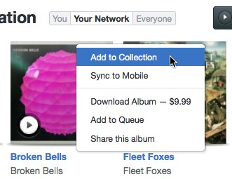
They've cut it back to two options. But what you're not seeing here is that if you choose "Sync to Mobile", you're also adding it to your collection. They cut it back to two options by kicking out #2 in the above list -- not #3. They understand that from the user's mindset, if you care enough about the music to download it, you obviously at least care enough to bookmark it for later as well.
It's a simple thing after you see it, but isn't always obvious before. This is one of the things a "product person" does. They're the ones that say "if a person wants A, then they obviously want B as well" (or conversely sometimes, "if a person wants A, they won't want B"). You can see Eric Marcoullier did the same thing here on OneTrueFan:
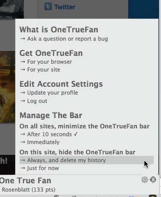
Under the "On this site, hide the OneTrueFan bar", we see the same pattern of many-options-and-inferred-outcomes.
- Hide the bar temporarily
- Hide the bar permanently
- Delete my history permanently
However, if you want to permanently delete your history, why would you want to keep the bar around? This product insight lets him bring the number of choices back to two, clean up the UI, and increase the simplicity of using the product.
What other types of good product insight have you seen like this?